Brief -
A craft brewery start-up, Bad Luck Brewing required a brand identity and can design for the launch of their debut pilsner - Unlucky13. Bad Luck wanted to draw emphasis to their name while prefering to keep things minimalistic, with a clear, concise identity focusing on colour and strong, bold design.

Development -
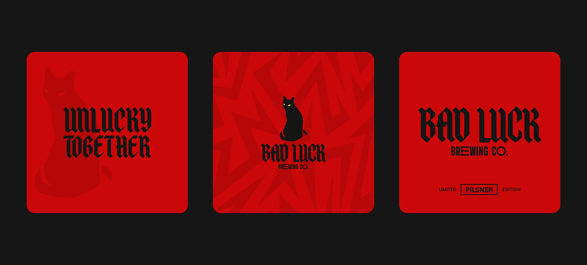
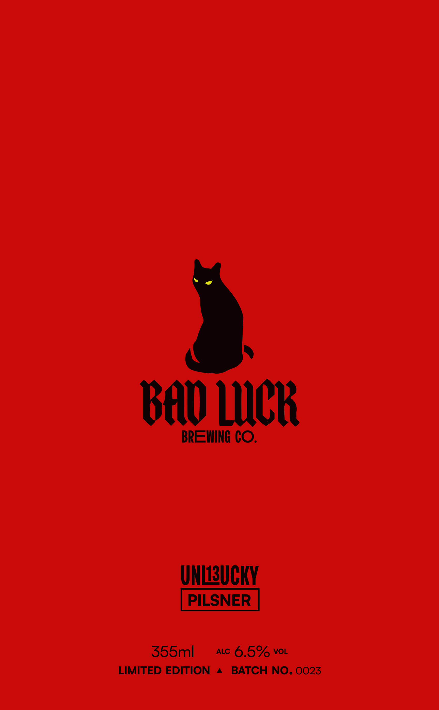
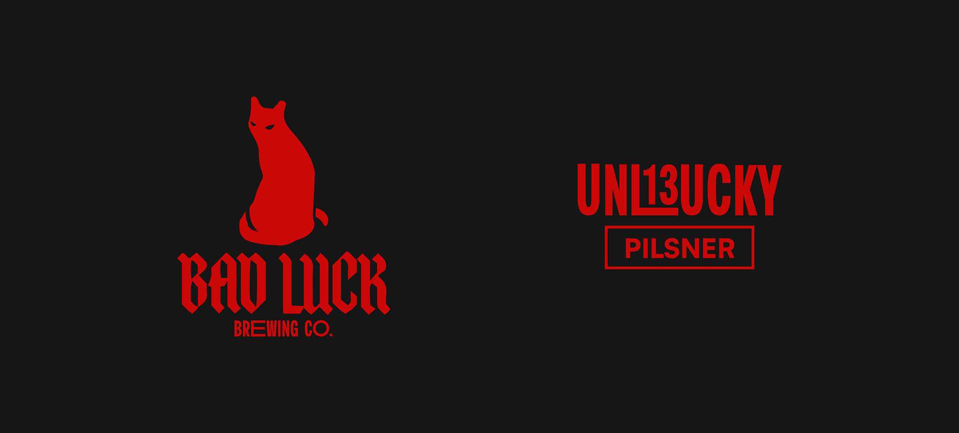
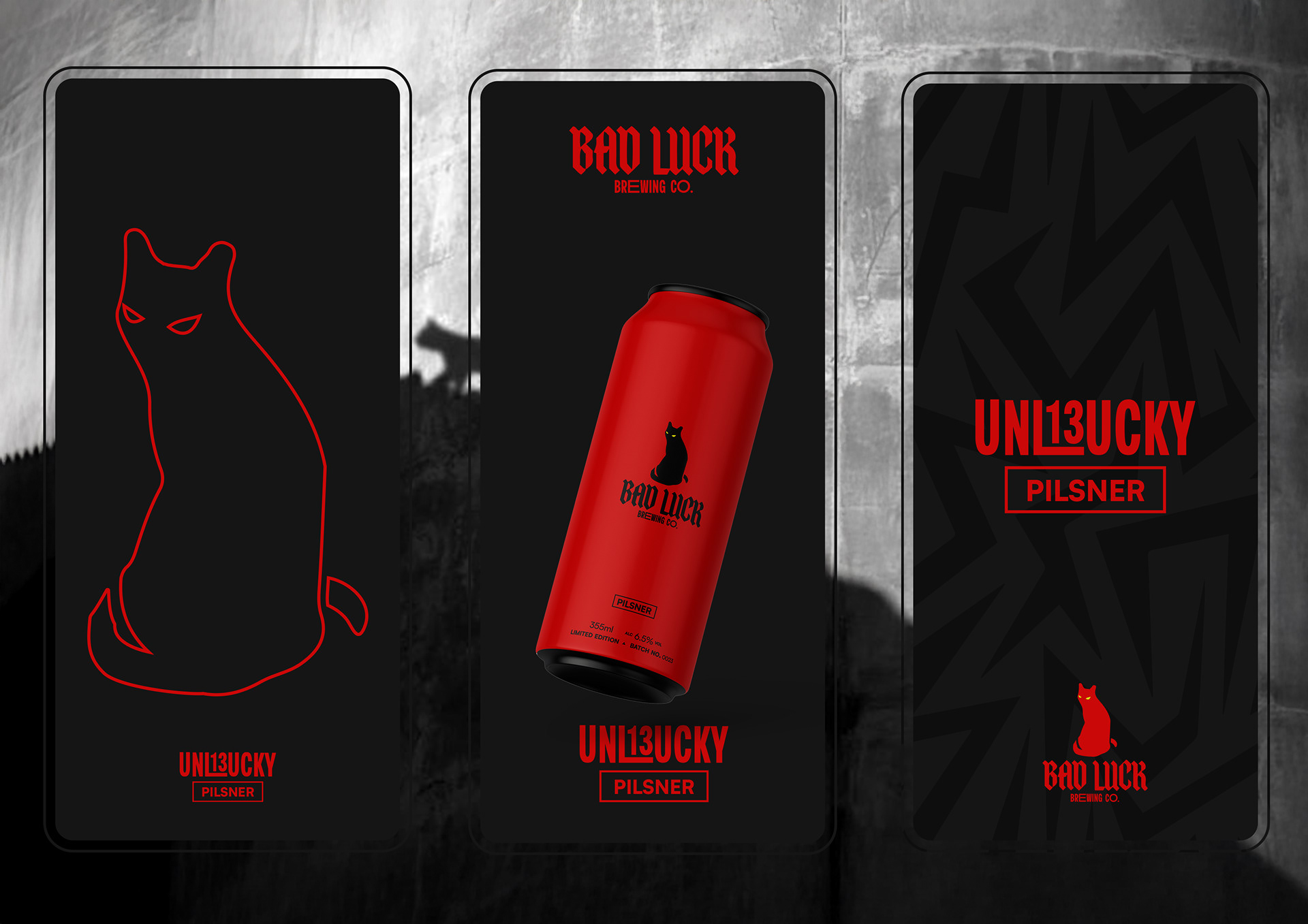
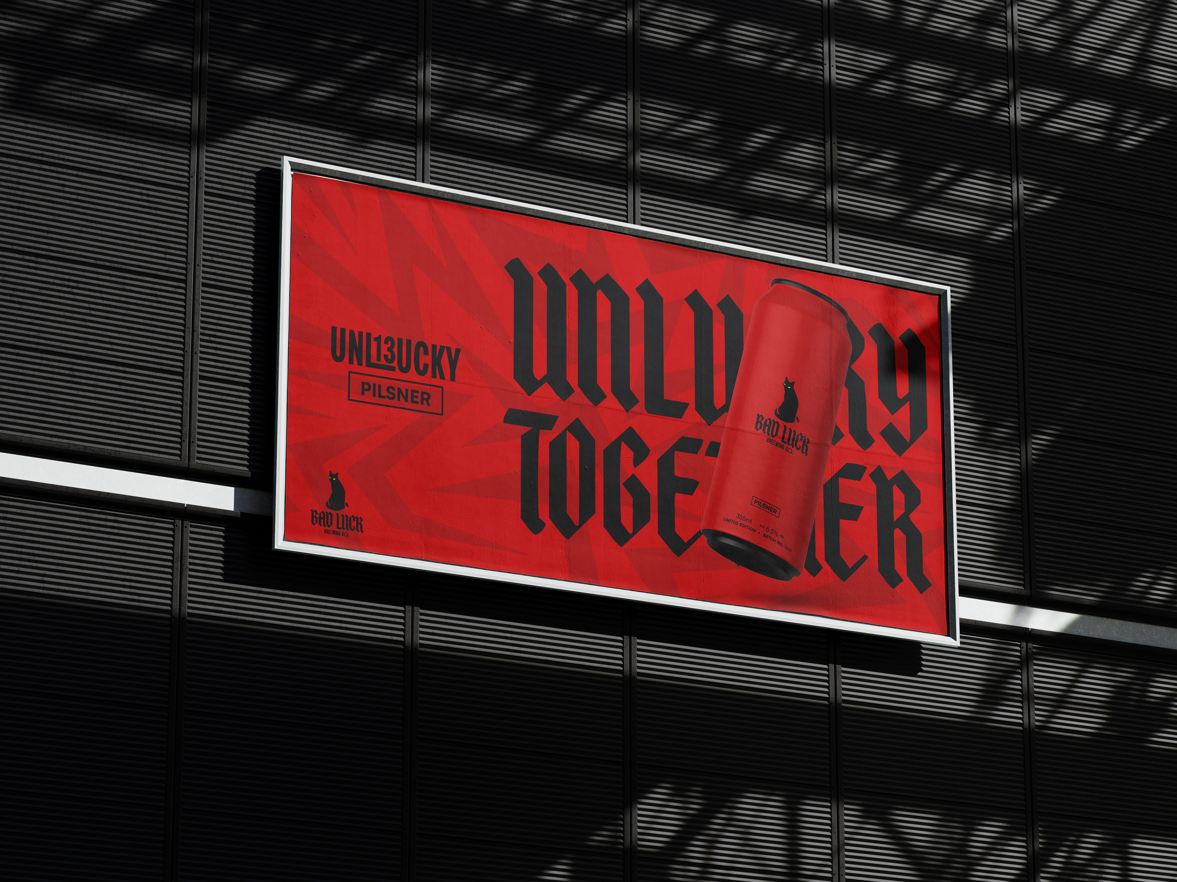
Bad Luck was a project that was straight to the point - black cat, lightning bolt, the number 13 - all aspects the brewery wanted to focus on to establish a strong brand identity. The development and research process looked at tradition and folklore, merging these elements with modern minimalism and contemporary design in an attempt to make a can design that was eye catching but not over-the-top.
Answer -
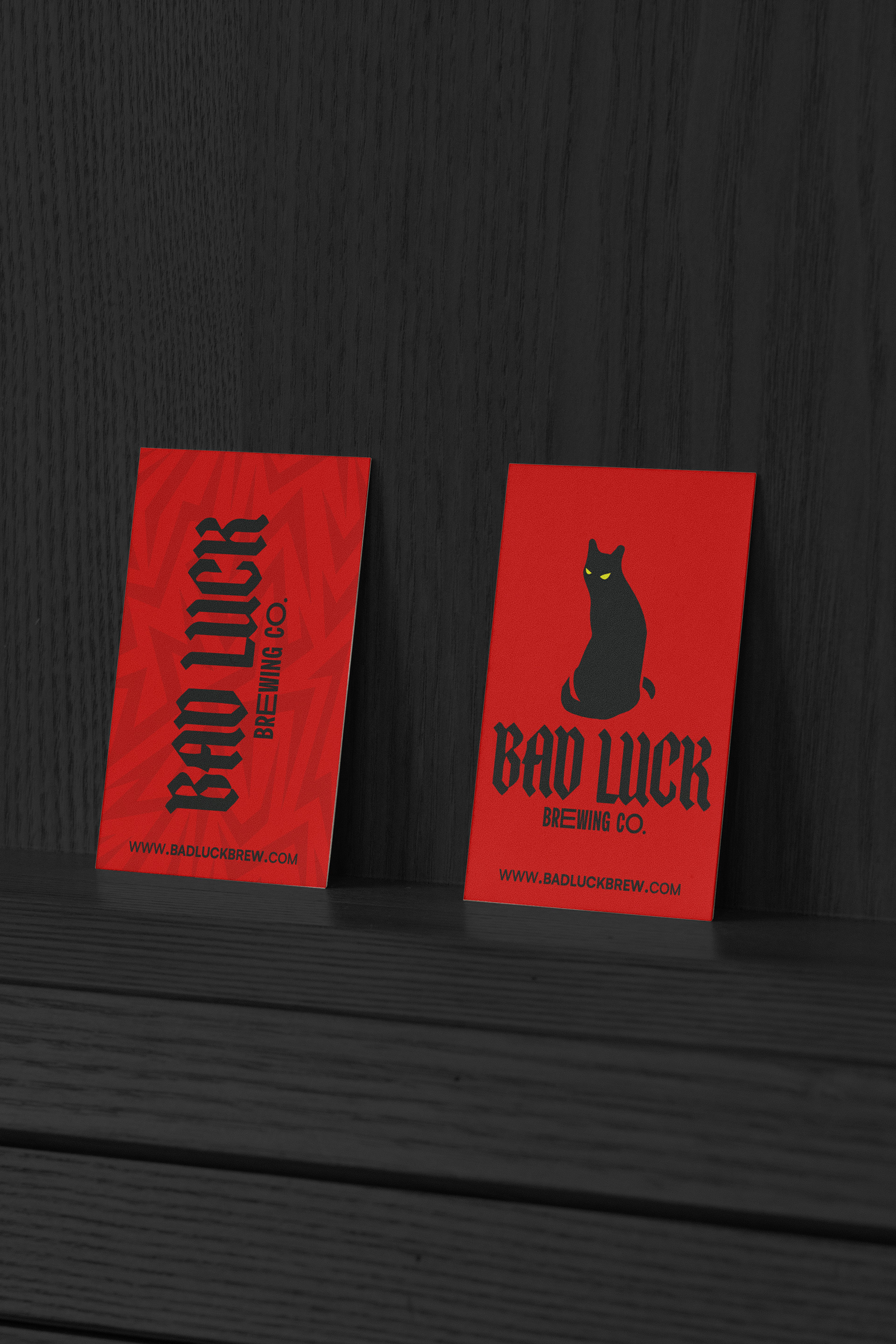
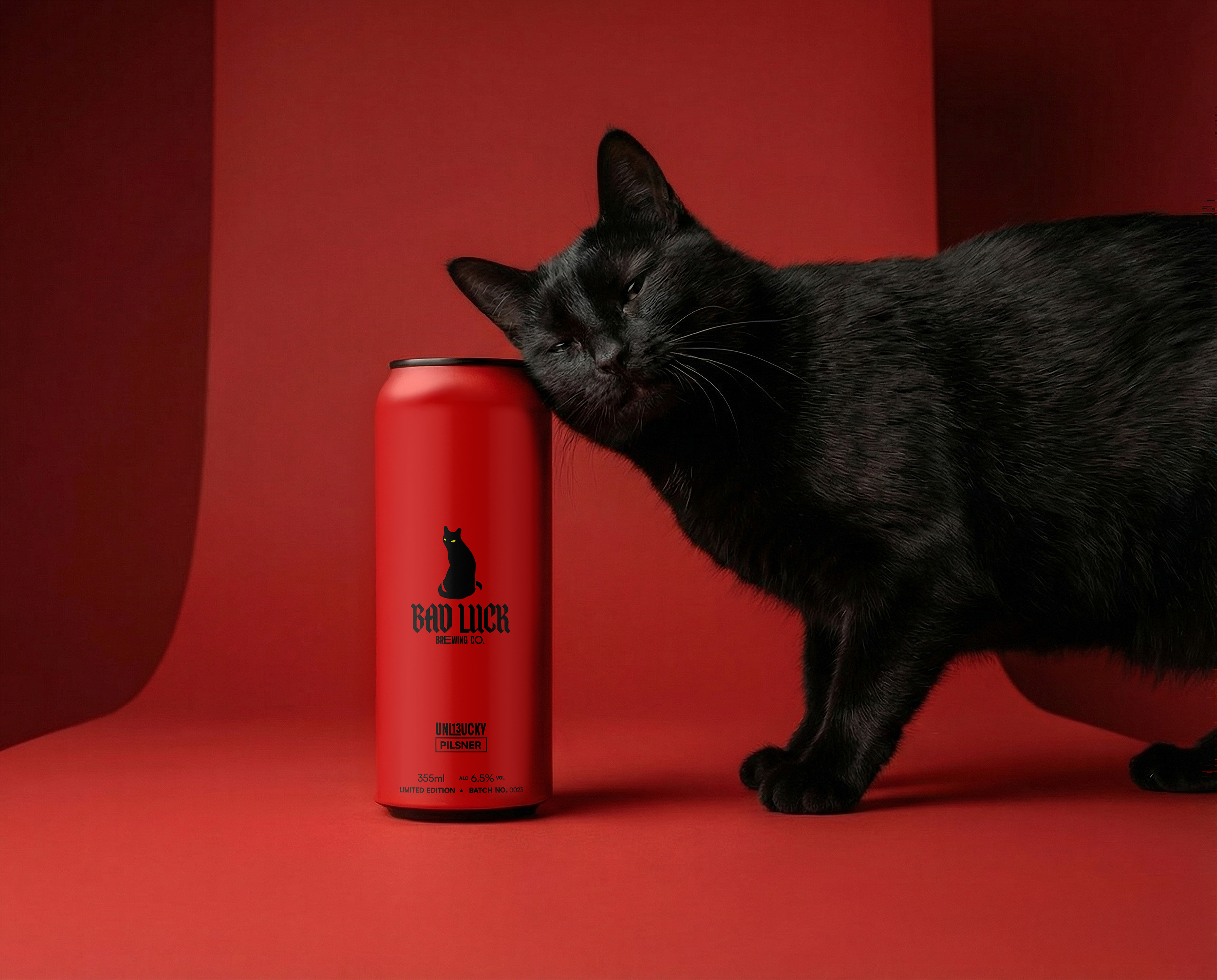
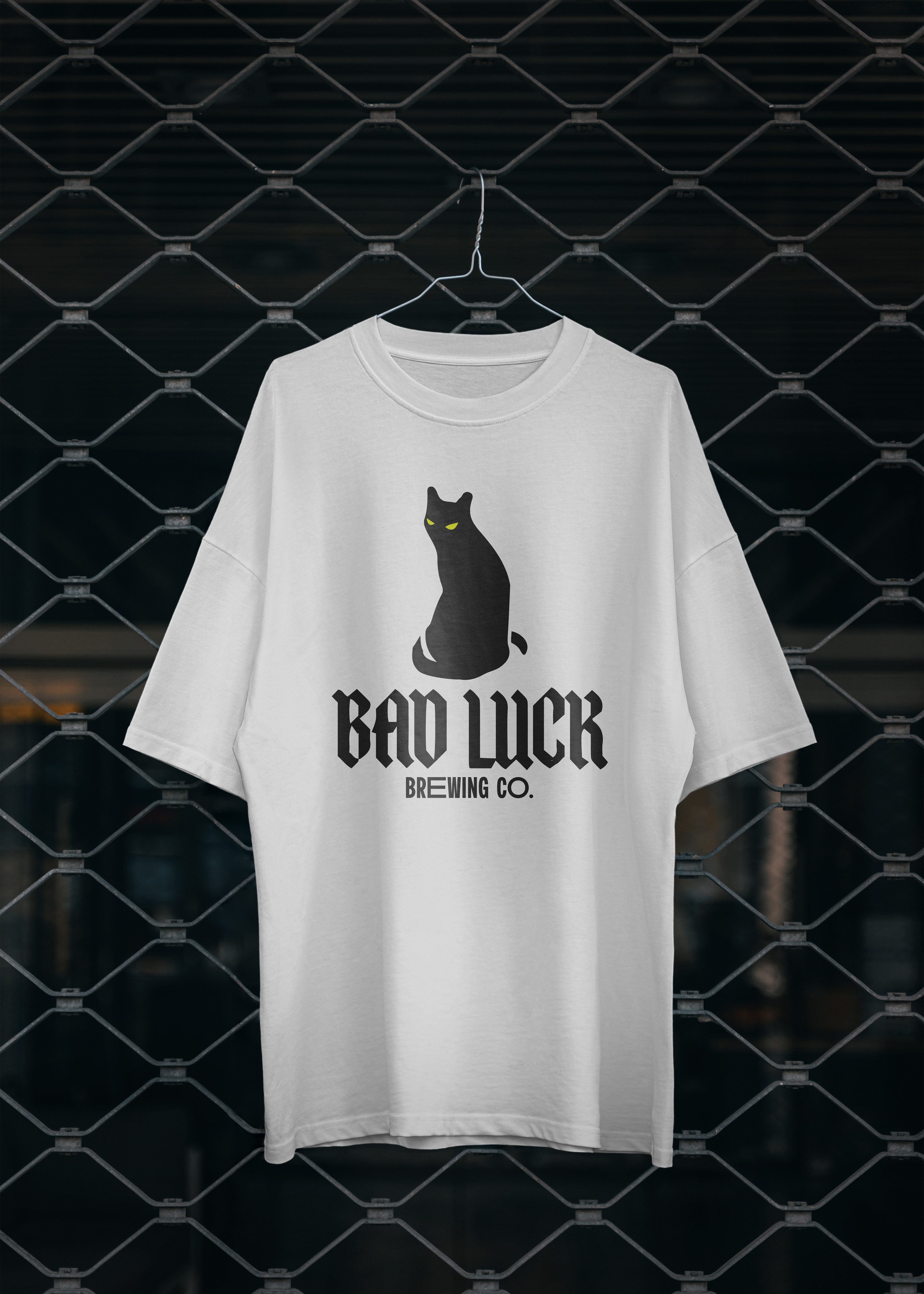
Bad Luck’s outcome focused on the concept of 'less is more.' A black and blood-red colour scheme, paired with a modern blackletter typeface and the traditional omen of bad luck - the black cat - resulted in a simple and bold logo and can design that could be incorporated across all platforms both digital and print.
The final can design was to be printed with matte paint on a matte black aluminium can, a detail that emphasised craftsmanship and a hand-made feel.
The final can design was to be printed with matte paint on a matte black aluminium can, a detail that emphasised craftsmanship and a hand-made feel.